
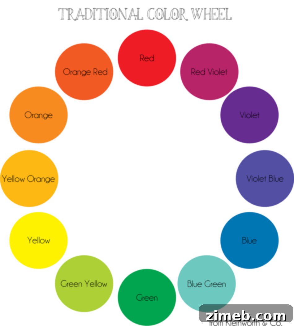
Food photography is an intricate art form that transforms everyday dishes into captivating visual narratives. While the resulting images often appear effortless and inherently beautiful, the meticulous process behind staging those perfect shots demands significant planning and attention to detail. The true mark of mastery lies in making the final composition look authentic and unforced – a testament to a well-executed setup. Overdoing it can result in an obviously staged appearance, which frequently detracts from the inherent appeal of the food itself. Some photographers genuinely prefer a minimalist approach to their food shots, allowing the culinary creation to shine with simple, clean compositions, which can be profoundly stunning. I often lean towards this route, depending on the specific dish I am showcasing. However, my typical inclination is to arrange my shot to appear as “normal” and “true to real life” as possible. When pursuing this style, it’s beneficial to incorporate elements that would naturally accompany your subject when served in a genuine setting, adding a layer of realism and relatability to your images.
Consider the commonplace items that are habitually present during a meal. Napkins, for example, are almost a constant fixture in my home whenever we eat. Plates, cutlery, and glassware are also fundamental components. The pivotal secret to making your food truly “pop” in your images, thereby elevating them from merely good to truly outstanding, resides in the thoughtful selection of these seemingly mundane props. It’s about utilizing items like plates and napkins not just for their functional purpose, but strategically. They should either harmoniously complement or create a striking, deliberate contrast in color with your main subject, thereby generating compelling visual interest and depth. To simplify this crucial aspect of food styling and empower you with effective tools, I decided to create this comprehensive Color Wheel Printable. This invaluable resource is designed to guide you in choosing the most effective colors for your prop selection, ensuring your food photography commands attention. Additionally, we’ve included Free Printable Checklist Templates to help streamline your entire staging process, making it more efficient and less daunting.
Unlocking Visual Appeal: Your Guide to Prop Color Selection
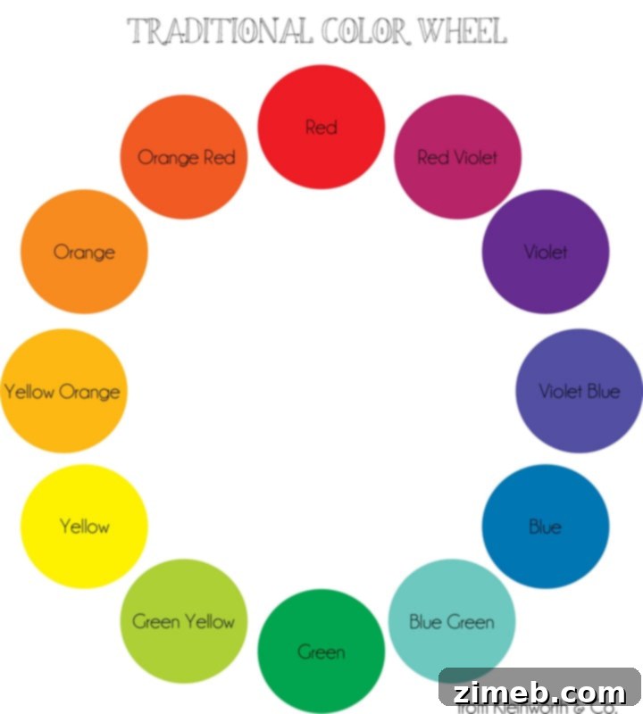
Download Your Essential Food Photography Color Wheel
The fundamental principle when leveraging the color wheel for impactful food photography is to choose props whose colors are positioned directly opposite your food’s predominant color on the wheel. This creates what is known as a complementary color scheme, which is renowned for its ability to produce high visual contrast and strikingly vibrant, eye-catching images. To grasp this concept more thoroughly, let’s briefly revisit basic color theory. Your primary colors are red, blue, and yellow – these are the foundational hues from which all other colors are derived. By combining these primary colors, you form your secondary colors: green (a mix of blue and yellow), orange (a mix of red and yellow), and purple (a mix of red and blue). Beyond these, there exists a vast spectrum of tertiary colors and subtle variations, offering endless possibilities for nuanced expression in your photography. Typically, I gravitate towards direct complementary pairings across the color wheel. However, I sometimes deviate from this strict rule, especially if the colors are red or green and it’s not the Christmas season, to avoid an overly thematic or clichéd aesthetic.
Occasionally, moving away from the rigid “across the wheel” rule can yield equally compelling results. Instead of a direct complementary color, you might opt to select props from a ‘color family’ – utilizing analogous colors that are situated next to each other on the color wheel. This approach often cultivates a more harmonious and serene visual composition, perfectly suited for conveying a particular mood or a sense of subtle elegance. The overarching goal, whether you choose complementary or analogous colors, is to identify hues that allow the inherent colors of your main food subject to truly resonate and draw the viewer’s attention. This strategic application of color theory has the power to transform a basic food shot into a dynamic and memorable photograph, meticulously guiding the viewer’s gaze precisely where you intend it – to the exquisite dish you are proudly showcasing.
The Power of Contrast: A Visual Demonstration
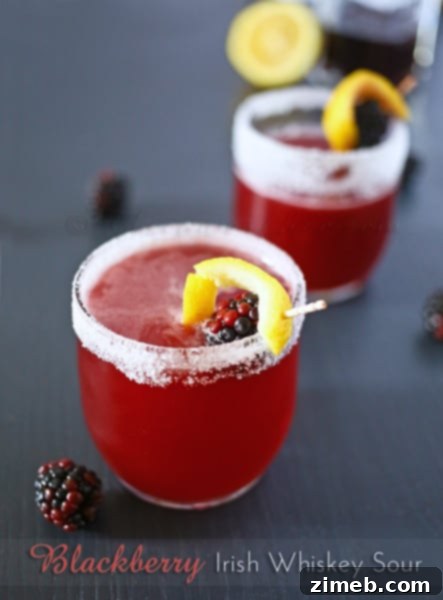
An excellent real-world example of this principle can be observed in my photograph of the Blackberry Whiskey Sour. The drink itself exhibits a rich red-violet coloration. To truly amplify this vibrant hue and infuse the image with greater visual fascination, I intentionally introduced the bright yellow of a lemon twist. On the color wheel, yellow is positioned directly opposite purple/violet, making it an ideal complementary color. This deliberate choice generated a powerful visual contrast, causing the deep, luxurious tones of the drink to become even more pronounced and incredibly alluring. The yellow here functions not merely as a decorative garnish; it serves as a critical styling element that significantly enhances the overall impact and appeal of the shot. This careful and considered interaction of colors is what truly elevates a competent food photograph to an exceptionally compelling one, making the food irresistible to the eye.
Enhancing Your Visual Narrative: Beyond Color Theory
As you continue to explore various examples throughout my blog, you will consistently observe how I consciously employ either contrasting or complementing colors between the featured dish and the surrounding items styled within the frame. This intentional use of color is a recurring and fundamental theme in my work, essential for creating cohesive, aesthetically pleasing, and highly effective food photography. It extends beyond mere visual appeal; it’s about artfully guiding the viewer’s eye, stimulating appetite, and constructing a compelling visual story. The downloaded color wheel will become an indispensable reference point for all your future food photography endeavors. Sometimes, the simple act of seeing potential color combinations juxtaposed on the wheel can ignite enough inspiration to confidently guide your prop selection and dramatically elevate the quality and impact of your images. Never underestimate the power of such visual aids in refining your artistic choices and achieving your desired photographic outcomes.
Beyond the critical aspect of color, numerous other prop considerations contribute significantly to the overall success and impact of your food photography. Give thoughtful consideration to textures: the rustic charm of a worn wooden cutting board versus the sleek elegance of a polished marble surface, the soft drape of a linen napkin against the crispness of a simple cotton one. These varied textures add crucial depth, sensory appeal, and character to your composition. The scale and proportion of your chosen props relative to the main food subject are equally vital; an oversized prop can inadvertently overwhelm a delicate dish, while overly tiny elements might get lost and fail to register within the frame. Contemplate the overarching narrative you wish to convey. Are you aiming for a cozy, inviting, home-cooked atmosphere or a sophisticated, refined gourmet presentation? Your prop selections should meticulously align with this storytelling objective. Lighting, naturally, plays a paramount role, interacting dynamically with your props to sculpt shadows, create alluring highlights, and establish an overall mood. Experiment with diverse angles and arrangements to uncover what truly accentuates your dish in the most flattering and appealing manner. Consistently building a diverse collection of versatile props over time will undoubtedly enrich your styling capabilities and expand your creative horizons.
Developing a discerning eye for prop selection and mastering color theory in food photography is an ongoing journey of continuous learning, experimentation, and artistic growth. Do not shy away from trying new and unconventional combinations, even if they initially seem daring. Take time to observe the work of other accomplished food photographers; analyze their prop choices and endeavor to understand how they effectively utilize color to create profound impact. Every single dish presents a unique and exciting opportunity to practice, refine, and evolve your styling techniques. Over time, you will cultivate an intuitive sense for what truly works best, transforming your food photos from mere snapshots into captivating culinary artworks that resonate with your audience. Always remember, each prop you select, and every color choice you make, contributes profoundly to the overall narrative, aesthetic, and visual appeal of your final image, making it an integral and transformative part of the entire creative process.
Seeking More Advanced Food Photography Tips?
Dive Deeper: Explore Food Photography Behind the Scenes Insights
For a comprehensive list of where I am linking today, including additional valuable resources and connections within the vibrant food blogging community, be sure to visit HERE for further inspiration and opportunities to enhance your craft.